
Software Guides
How to Make a Box and Whisker Plot in Tableau
Learn how to make a box and whisker plot in Tableau using Show Me and the Analytics pane, then configure marks, whiskers, outliers, and filters.
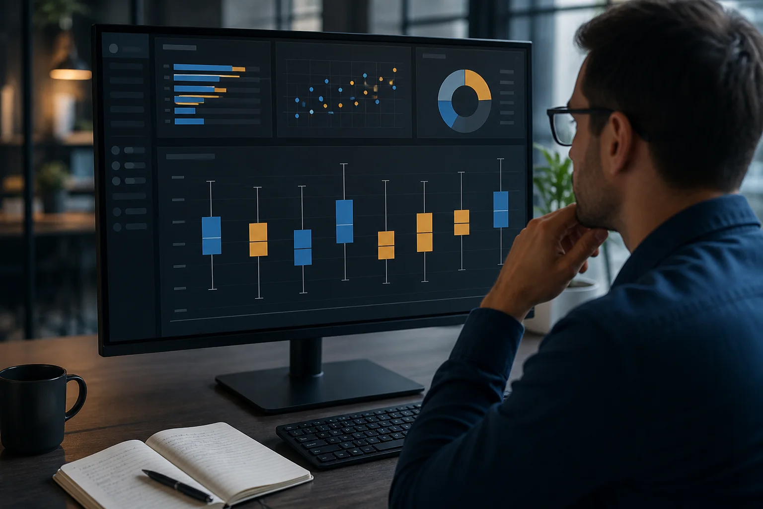
To learn how to make a box and whisker plot in Tableau, place a categorical dimension on the Columns shelf and a numerical measure on the Rows shelf. Add a record-level identifier to Detail when needed, then choose the box-and-whisker chart from Show Me. You can also drag Box Plot from the Analytics pane onto the view.
Field placement matters because Tableau calculates each box from the marks available within a category. If your view contains only one aggregated mark per group, Tableau has no meaningful distribution from which to calculate quartiles and whiskers. Using the right level of detail is therefore just as important as selecting the correct chart.
This tutorial uses shipping methods and delivery times to demonstrate the complete workflow, including aggregation, outliers, filters, formatting, grouped comparisons, and common errors.
Quick Tableau Workflow
For a basic Tableau box plot:
- Place Shipping Method on Columns.
- Place Delivery Days on Rows.
- Drag Order ID to Detail on the Marks card.
- Open Show Me.
- Select the box-and-whisker chart.
- Use Swap Rows and Columns if you prefer a horizontal layout.
- Edit the box plot to configure its whiskers, fill, borders, and underlying marks.
The category field separates the data into groups. The measure provides the numerical values being compared, while the identifier on Detail gives Tableau multiple marks from which to calculate each distribution.
What the Data Must Contain
A successful box plot needs more than a column of category names and one summary value. It needs a numerical distribution within each category.
In the delivery example, the fields serve these roles:
| Field | Tableau role | Purpose in the view |
|---|---|---|
| Shipping Method | Dimension | Divides orders into groups |
| Delivery Days | Measure | Supplies the numerical values |
| Order ID | Dimension on Detail | Creates an individual mark for each order |
| Region | Optional dimension | Adds another comparison level |
A dimension usually contains categories, labels, dates, or identifiers. A measure contains numerical values Tableau can aggregate. Delivery Days is the measure because the chart compares the spread of delivery times.
The measure should normally create a continuous quantitative axis. A green measure pill usually indicates a continuous field, although color alone should not replace checking the field’s actual role and data type.
Every category also needs enough observations to form a distribution. If a shipping method appears once, its “box” may collapse into a line because the minimum, quartiles, median, and maximum are identical. That is a property of the available data rather than a drawing failure.
How to Make a Box and Whisker Plot in Tableau With Show Me
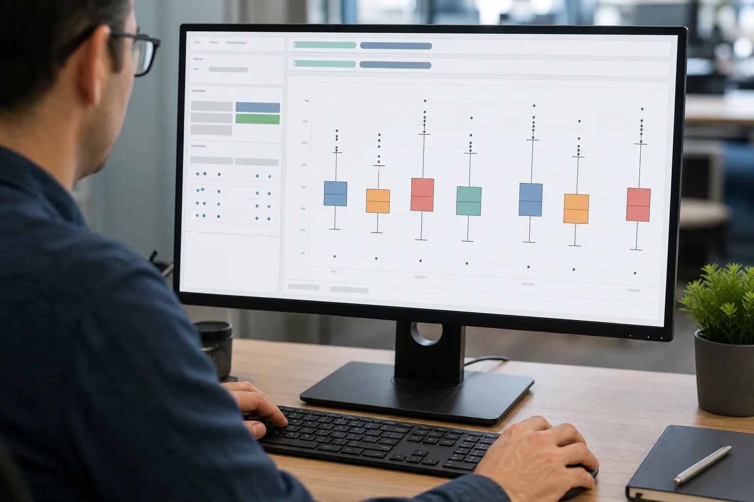
Show Me is the fastest method for most beginners because Tableau selects the required mark type and adds the statistical box automatically.
1. Connect the data
Open a worksheet after connecting to the relevant spreadsheet, database, extract, or published data source. Confirm that Delivery Days is recognized as a numerical field and that Order ID and Shipping Method are available as dimensions.
Correct any unsuitable data types before building the view. A delivery-time column imported as text cannot create a proper continuous numerical axis until its type is corrected.
2. Place the category on Columns
Drag Shipping Method from the Data pane to the Columns shelf. Tableau creates a separate header for each method, such as Standard, Express, Same Day, or Pickup.
This division determines which observations belong to each box.
3. Place the measure on Rows
Drag Delivery Days to the Rows shelf. Tableau may initially display bars because measures are aggregated by default.
Check the aggregation shown on the measure pill. Depending on the data structure, Tableau may use SUM(Delivery Days), AVG(Delivery Days), or another aggregation. For this example, each order should contribute its own delivery-time observation rather than one total for the entire shipping method.
4. Establish record-level detail
Drag Order ID to Detail on the Marks card. This changes the view’s level of detail without printing Order ID as a visible label.
Tableau can now create a separate mark for each order within each shipping method. The box plot summarizes those marks rather than trying to calculate a distribution from one aggregated value.
If an order contains several source rows, adding Order ID to Detail may produce one aggregated Delivery Days mark per order rather than one mark per physical row. That may be the correct analytical level. Always decide what one observation is supposed to represent before selecting a field for Detail.
5. Select the chart
Open Show Me and choose the box-and-whisker plot icon. Tableau converts the view and places a statistical box within each shipping-method category.
If Show Me changes the location of a field, inspect the Columns shelf, Rows shelf, and Marks card afterward. Automatic chart construction is helpful, but its chosen field arrangement may not match the precise comparison you intended.
Building the Same View From the Analytics Pane
The Analytics pane provides another route when you have already constructed a useful mark view.
Start with Shipping Method on Columns and Delivery Days on Rows. Add Order ID to Detail and set the mark type to Circle. The worksheet should now show the individual delivery observations within each shipping group.
Next:
- Open the Analytics tab beside the Data pane.
- Locate Box Plot.
- Drag it into the worksheet.
- Drop it on the available target marked Cell.
The box-plot scope is Cell. In practical terms, Tableau calculates a separate box for the marks belonging to each cell created by the dimensions in the view.
This method is especially useful when you want to retain visible dots behind or around the boxes. The dots help readers see mark density, clusters, gaps, and observations beyond the whiskers.
Tableau Desktop can show both a summarizing Box Plot option and a Custom Box Plot option in the Analytics pane. The custom option opens the configuration dialog when placed in the view. Web-authoring interfaces may provide fewer custom paths, so the controls displayed in Tableau Cloud or Tableau Server can differ from Tableau Desktop.
The Reference-Line Route in Tableau Desktop
A box plot in Tableau is handled as an analytical reference object. In Tableau Desktop, you can begin with a mark view, right-click the continuous numerical axis, and choose Add Reference Line. In the resulting dialog, select the Box Plot option.
This route exposes the box settings directly and is useful when the Show Me result needs more control. It also explains why clicking a box-plot line may present commands such as Edit Reference Line, Format, or Remove.
The menu wording can vary slightly between releases. If the direct axis command is unavailable, use the Analytics pane instead. Both approaches add the statistical summary to an existing view rather than requiring calculated fields for Q1, the median, and Q3.
Aggregation Determines What Each Mark Means
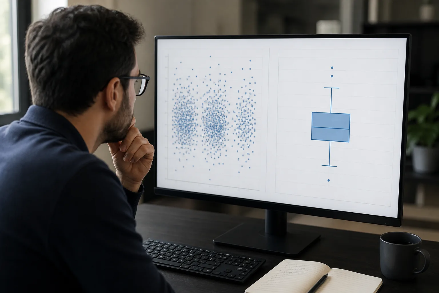
Aggregation is the most common source of confusing Tableau box plots. Tableau normally combines rows at the level of detail defined in the view. If Shipping Method is the only dimension present, the software may produce one aggregated Delivery Days value for each method.
One value cannot reveal a distribution. The resulting box may collapse into a line, contain no useful whiskers, or fail to communicate anything beyond the aggregate itself.
There are two main ways to create more marks.
Add an identifying dimension to Detail
Dragging Order ID to Detail creates marks at the order level. This is usually the safer approach because it lets you choose the unit being analyzed.
Other suitable identifiers might include:
- Customer ID for a distribution of customer-level values
- Product ID for product-level performance
- Employee ID for employee-level results
- Transaction ID for transaction-level measurements
- Month of Order Date for monthly aggregates
The correct choice depends on the question. A chart of delivery time per order should not silently become a distribution of averages per region or totals per customer.
Disaggregate the source rows
You can open the Analysis menu and clear Aggregate Measures. Tableau then attempts to show separate marks from the underlying rows.
Disaggregation is useful when each source row truly represents one observation. It is not an automatic fix for every box plot. A large data source may create hundreds of thousands of marks, slow the workbook, and make the view difficult to render.
It can also produce the wrong analytical unit. If one order occupies five line-item rows, disaggregation may count the same order-level delivery time five times. Adding Order ID to Detail and using an appropriate aggregation may better represent the data.
Understanding the Box, Whiskers, and Dots
The central box covers the middle 50% of the displayed marks. Its lower boundary represents the first quartile, or 25th percentile. Its upper boundary represents the third quartile, or 75th percentile. The distance between them is the interquartile range:
IQR = Q3 − Q1
The line inside the box is the median, or 50th percentile. It separates the lower and upper halves of the displayed distribution.
A taller vertical box indicates more variation in the middle half of the values. A short box indicates that those observations are closer together. If the median sits near one side of the box, or one whisker is much longer, the distribution may be asymmetric.
The meaning of the whiskers depends on the selected configuration.
| Whisker setting | Meaning |
|---|---|
| Data within 1.5 times the IQR | Whiskers extend to the furthest displayed marks within the IQR limits |
| Maximum extent of the data | Whiskers extend to the most extreme displayed marks |
The first option creates what is often called a schematic box plot. Marks beyond the whiskers appear as potential outliers. The maximum-extent option creates a skeletal box plot and places the whiskers at the furthest values in the displayed distribution.
For this reason, whiskers do not always represent the absolute minimum and maximum. Their meaning must be interpreted according to the active setting.
Treat Outliers as Questions, Not Errors
Under the 1.5-IQR setting, marks beyond the whiskers are potential outliers. A delayed delivery caused by severe weather, a stock shortage, or an address problem may be unusual but completely valid.
Before removing such a mark, investigate:
- Whether the source value was entered correctly
- Whether the unit matches the rest of the measure
- Whether the observation belongs to the selected population
- Whether a rare real-world event explains the result
- Whether duplicated or joined records have distorted its weight
Hiding the circles beneath a Tableau box plot does not remove their observations from the statistical calculation. Likewise, changing mark opacity only alters the display.
Filtering a record is different. A filter that removes data before the box is computed can change Q1, the median, Q3, the IQR, whisker positions, and which remaining marks qualify as outliers. Document material exclusions so readers understand what the chart represents.
Create Grouped and Side-by-Side Comparisons
To compare delivery distributions by both Shipping Method and Region, add Region as another discrete dimension.
Placing Region to the right of Shipping Method on Columns creates nested groups. Each shipping method contains a separate box for each region. Reversing the field order changes the hierarchy: regions become the outer groups and shipping methods appear inside them.
Region can also be placed on Color, but color alone does not always create separate statistical cells. If the goal is a distinct box for each category combination, place the grouping dimension where it partitions the view appropriately.
Avoid adding too many categories. Twenty regions across six shipping methods may produce a technically correct chart that is too crowded to read. Filter to relevant groups, divide the analysis into separate worksheets, or use a dashboard control when the comparison becomes dense.
For a box plot with multiple measures, advanced users can work with Measure Names and Measure Values. Sales, Profit, and Delivery Days may use very different units, however. Placing them on one shared scale can be misleading. Compare measures together only when their units and ranges support a meaningful visual relationship.
Change the Orientation and Appearance
A vertical layout places categories across the horizontal axis and measure values on the vertical axis. Selecting Swap Rows and Columns changes the chart to a horizontal orientation.
Horizontal boxes often work better when category labels are long. Vertical boxes may fit better when there are only a few short category names.
To edit the statistical object, click one of its lines or right-click the quantitative axis and select the available editing command. Depending on the Tableau product and interface, you may be able to change:
- Whiskers from 1.5-IQR to maximum extent
- Box fill color
- Fill opacity
- Border or line appearance
- Underlying mark visibility
- Tooltip details
Keep the individual marks subtle if the main goal is comparing medians and IQRs. Light circles with partial transparency can provide distribution detail without overpowering the boxes.
Use clear category names, a descriptive axis title, and a worksheet title that identifies both the measure and grouping variable. “Delivery-Time Distribution by Shipping Method” is more useful than “Box Plot.”
Tooltips can include Shipping Method, Order ID, Delivery Days, and Region. Remove fields that do not help interpretation; a tooltip filled with internal identifiers and technical calculations can distract from the observation being examined.
Filters Can Change the Statistical Story
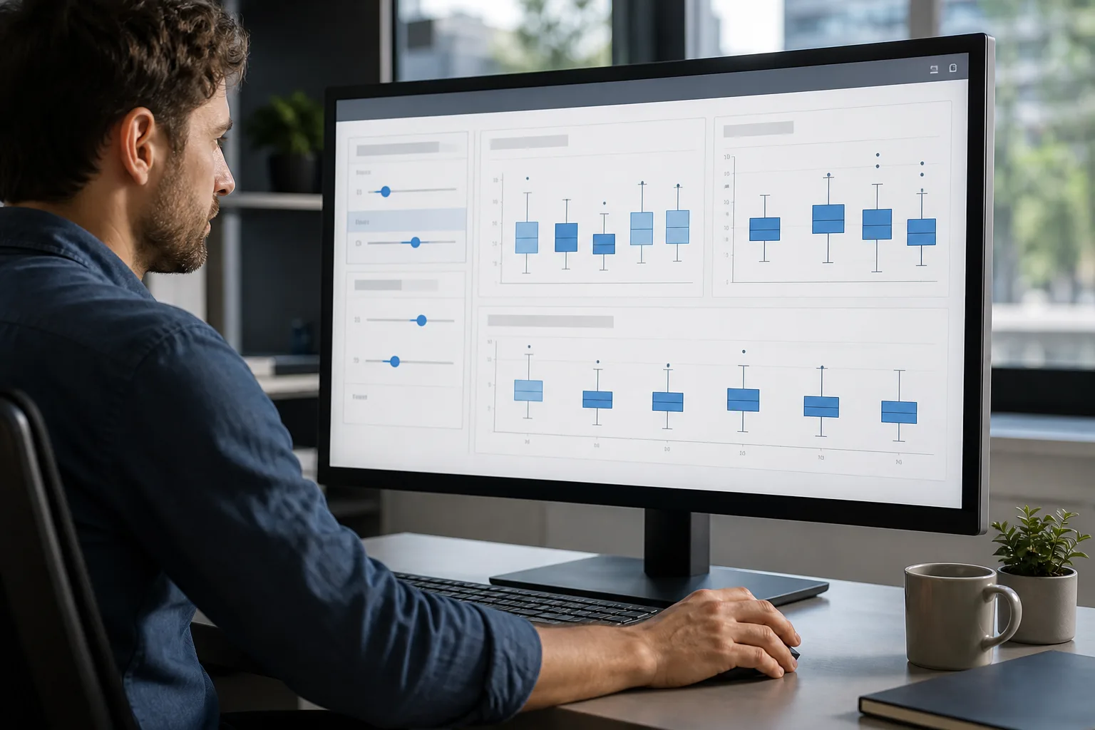
Filters do more than reduce the number of boxes on screen. They can modify the population from which each box is calculated.
Suppose Standard shipping has delivery times from all regions. Filtering the worksheet to one region produces a new regional subset. The median and quartiles may move because Tableau is now summarizing different marks.
A date filter can have a similar effect. Comparing one month with a full year may alter both the center and spread. This is expected behavior, not evidence that the Tableau statistical chart is unstable.
Before publishing a dashboard:
- Apply each interactive filter.
- Check whether categories are left with too few marks.
- Confirm that the resulting boxes remain meaningful.
- Review whether outlier status changes.
- Explain the active filter context in the title or caption.
Null values also require attention. Tableau may exclude null measures from the numerical calculation or display an indicator, depending on the view. Determine why the values are missing before choosing to filter, replace, or retain them elsewhere in the analysis.
Why the Box Plot Is Missing or Looks Wrong
Use the following checks before rebuilding the worksheet.
| Symptom | Likely explanation | Practical fix |
|---|---|---|
| Show Me icon is unavailable | Required fields are not selected or the measure is unsuitable | Select a dimension and numerical measure; verify the data type |
| Box Plot is unavailable in Analytics | The view lacks a compatible continuous axis or marks | Build the measure-and-dimension view first |
| Each category shows one line | Tableau has only one mark per group | Add the correct identifier to Detail |
| The boxes contain no whiskers | Values are identical or there are too few distinct marks | Inspect the source values and mark count |
| There are many unexpected dots | The distribution has extreme values or the grain is wrong | Check the IQR setting, duplicates, joins, and level of detail |
| The results change after filtering | The filter changed the displayed population | Confirm the intended filter context |
| The chart is slow | Disaggregation created too many marks | Aggregate at a meaningful level or reduce the working data |
| Categories disappear | Filters or null dimensions removed their records | Review filters and missing values |
If the chart still appears incorrect, inspect one category on its own. View the underlying marks, confirm the measure aggregation, and check what each mark represents. Most apparent calculation problems are actually differences in granularity or filtering.
Reading the Visualization Responsibly
Begin by comparing medians. A higher median Delivery Days value indicates that the center of one group lies above another, but it does not explain why.
Next, compare IQRs. A narrow box suggests more consistent results within the middle half, while a wide box indicates greater variability. Inspect whiskers and separate points for unusual ranges or potential exceptions.
Avoid ranking groups from the median alone when their sample sizes differ greatly. A box based on six orders carries a different level of evidence from one based on sixty thousand orders. Tableau can show the distributions, but the chart does not automatically judge whether the difference is practically important or statistically reliable.
Also remember that a box plot compresses information. It may hide clusters, gaps, or multiple peaks. Keeping the underlying circles visible—or pairing the view with another distribution chart—can reveal patterns the five-number summary does not show.
Frequently Asked Questions
What fields are needed for a Tableau box plot?
You generally need a numerical measure on a continuous axis and a dimension that divides the marks into categories. Each category must also contain multiple observations. Add an identifying field, such as Order ID, to Detail when Tableau would otherwise aggregate the category into one mark.
Why is the box-and-whisker option grayed out in Show Me?
Show Me may not have a compatible measure or field combination selected. Verify that the numerical field has the correct data type and creates a quantitative axis. Select the relevant dimension and measure before opening Show Me. A chart may also need enough marks to produce a useful distribution.
Should I turn off Aggregate Measures?
Only when each source row is genuinely the observation you intend to analyze. Disaggregating can create an excessive number of marks and may duplicate an order-level value across several line-item rows. Adding an appropriate identifier to Detail often gives better control over the analytical grain.
Why does my Tableau box plot display only a line?
A box collapses when a category contains one mark, too few distinct observations, or several identical values. Check the Marks card and add the correct record-level dimension to Detail. Also inspect filters, because they may have reduced the category to a very small subset.
How do I create a horizontal box plot in Tableau?
Build the vertical chart normally, then select Swap Rows and Columns. The numerical measure moves to the horizontal axis and category headers move to Rows. This orientation is particularly useful when category names are long or when the number of groups makes horizontal labels difficult to read.
How does Tableau identify outliers?
With the 1.5-IQR whisker option, Tableau uses the interquartile range to establish the whisker limits. Marks beyond those whiskers appear separately as potential outliers. They are not automatically data errors. Selecting maximum-extent whiskers changes the display because the whiskers reach the furthest displayed observations.
Can I create several box plots in one Tableau worksheet?
Yes. Add another dimension to Columns or Rows to partition the view into additional cells. For example, Shipping Method and Region can produce grouped box plots. Keep the number of combinations manageable, and confirm that each group contains enough observations for a useful distribution.
Why does a box plot change when I use a filter?
A filter can remove observations before Tableau calculates the displayed distribution. The remaining marks may have different quartiles, median, IQR, whiskers, and outliers. The changed result is valid for the filtered population, provided that the filter and level of detail match the analytical question.
Build the View Around the Right Observation
The most reliable way to remember how to make a box and whisker plot in Tableau is to identify the unit of analysis before choosing the chart. Place the category and measure on the appropriate shelves, then make sure each box contains the marks it is supposed to summarize.
Use Show Me for speed, the Analytics pane for a prepared mark view, or Tableau Desktop’s reference-line controls for direct configuration. Once the distribution is correct, refine the orientation, whiskers, filters, and formatting without confusing a visual adjustment with a change to the underlying data.
Share this guide

About the author
Misbah Shafique
Misbah Shafique creates clear, carefully researched guides about box-and-whisker plots, statistics, data visualization, and practical math concepts.
Related articles

Ready to plot your own data?
Paste your values into our free tool, customize the result, and export a publication-ready box plot.
Open the box plot maker