
Software Guides
How to Make a Box and Whisker Plot in Excel
Learn how to make a box and whisker plot in Excel, format quartiles and outliers, compare groups, verify results, and fix common chart errors.

To learn how to make a box and whisker plot in Excel, place each group of numeric observations in a separate labeled column. Select the complete range, including its headers, and choose Insert > Insert Statistic Chart > Box and Whisker. Excel calculates the quartiles, median, whiskers, and potential outliers automatically.
The chart can then be refined through the Chart Design, Format, and Format Data Series controls. Those settings determine whether Excel displays individual observations, outlier points, mean markers, and inclusive or exclusive quartiles. The chart is quick to insert, but its accuracy still depends on clean source data, correct series grouping, and an appropriate quartile method. Excel does not decide those details for you.
Quick Excel Workflow
- Enter each data group in a separate column.
- Add a clear header above every group.
- Select the headers and all numeric observations.
- Open the Insert tab.
- Select Insert Statistic Chart.
- Choose Box and Whisker.
- Check the category labels and data orientation.
- Open Format Data Series to configure quartiles, outliers, means, points, and gap width.
- Add a meaningful title and axis label.
- Verify the quartiles and source data before using the chart.
In some Excel versions, the alternative menu path is Insert > Recommended Charts > All Charts > Box & Whisker.
Prepare the Worksheet Before Inserting the Chart
Excel builds its boxes from raw numeric observations. It works best when every comparison group has its own column and the first cell in that column contains a descriptive header.
For a single box, enter the following example in cells A1 through A11:
| Test Score |
|---|
| 2 |
| 4 |
| 5 |
| 7 |
| 8 |
| 9 |
| 10 |
| 12 |
| 15 |
| 30 |
Here, Test Score becomes the data-series name. The ten cells below it form the observations used to calculate one box.
The observations do not have to be sorted before Excel creates the chart. However, sorting can make manual inspection easier. Excel also does not clean errors automatically, so check the column for:
- numbers stored as text;
- accidental spaces;
- unit labels inside numeric cells;
- duplicated or omitted observations;
- formulas returning errors;
- blank cells with unclear meaning;
- hidden or filtered values;
- dates mistakenly included as measurements.
A blank may mean “no observation,” while zero is a real numeric value. Do not replace missing data with zero unless zero is the correct observation.
How to Make a Box and Whisker Plot in Excel Step by Step
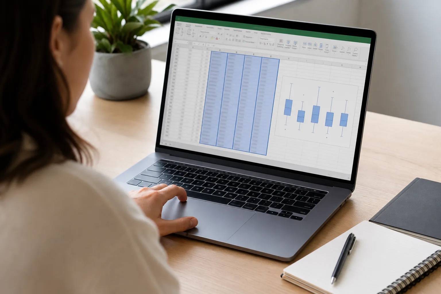
Once the worksheet is ready, create the chart using Excel’s built-in statistical chart.
1. Select the source range
For the single-series example, select A1:A11. Include the header so Excel can use it as the category or series label.
If you select only the numbers, Excel can still draw a box, but its automatic label may be less useful.
2. Open the statistical charts
Go to the Insert tab. In the Charts group, select Insert Statistic Chart, then choose Box and Whisker.
If that icon is not obvious, try:
Insert > Recommended Charts > All Charts > Box & Whisker
Menu names and icon placement may differ slightly by version, operating system, display size, or ribbon configuration.
3. Confirm what Excel created
A single numeric column should normally produce one vertical box. Inspect the chart for:
- a box showing the interquartile range;
- a line representing the median;
- whiskers showing the non-outlier range;
- a possible separate point at 30;
- the Test Score label.
The exact box boundaries depend on the quartile calculation selected in the chart settings.
4. Replace the generic chart title
Select the existing title and type something specific, such as:
Distribution of Test Scores
A useful title explains the variable or comparison rather than repeating “Box Plot.”
5. Add an axis title
Use Chart Design > Add Chart Element > Axis Titles. A suitable value-axis title might be:
Score (points)
Including units prevents readers from guessing what the scale represents.
Understand the Excel Box Plot Before Formatting It
Excel’s visual elements represent different statistics.
| Chart element | Meaning |
|---|---|
| Bottom of box | First quartile, Q1 |
| Line inside box | Median, Q2 |
| Top of box | Third quartile, Q3 |
| Box height | Interquartile range |
| Whiskers | Extreme non-outlier observations |
| Separate dots | Potential outliers when displayed |
| X marker | Mean, when mean markers are enabled |
| Inner points | Individual observations within the whisker range |
The line inside the box is the median, not the mean. Excel may show the mean as an X or another marker, depending on the selected chart options.
A median and mean can occupy the same or nearby positions, but they are calculated differently. The median is the middle of the ordered observations, while the mean is their arithmetic average.
Configure Format Data Series
Right-click one of the boxes and choose Format Data Series. The Series Options panel contains the controls most relevant to an Excel box plot.
Gap width
Gap width controls the visual space between boxes. Reducing it usually makes the boxes wider; increasing it makes them narrower and farther apart.
This setting changes appearance only. It does not alter any statistics.
Show inner points
This option displays the individual observations that fall within the whisker range. Inner points can reveal repeated values or small-sample patterns that the box alone hides.
With a large data set, showing every point may make the chart crowded. Use the option when individual observations add useful context.
Show outlier points
This displays observations Excel classifies as potential outliers under its chart calculation.
Turning the option off only hides their markers. It does not delete those observations or remove their influence from the worksheet. Anyone analyzing the chart should know whether outlier points were hidden.
Show mean markers
This adds a symbol for the arithmetic mean of each series. The marker can be helpful when comparing the mean with the median.
Do not mistake the mean marker for the median line.
Show mean line
For multiple series, a mean line connects their mean values. This may help show movement across ordered categories, but it can also imply a sequence where none exists. Use it only when connecting the group means has a meaningful interpretation.
Quartile calculation
Excel offers inclusive and exclusive quartile options. Changing this setting may move the bottom and top of the box and can also affect which observations qualify as potential outliers.
The setting should match the method required by your class, organization, software workflow, or reporting standard.
Audit Excel’s Quartiles With Worksheet Formulas
A chart should not be accepted simply because Excel produced it. You can verify the summary values beside the source data.
Assuming the single-series values are in A2:A11, use:
- Minimum: =MIN(A2:A11)
- Maximum: =MAX(A2:A11)
- Median: =MEDIAN(A2:A11)
- Inclusive Q1: =QUARTILE.INC(A2:A11,1)
- Inclusive Q3: =QUARTILE.INC(A2:A11,3)
- Exclusive Q1: =QUARTILE.EXC(A2:A11,1)
- Exclusive Q3: =QUARTILE.EXC(A2:A11,3)
The example’s minimum is 2, its median is 8.5, and its maximum is 30. The quartiles depend on the chosen algorithm.
Inclusive results
Using QUARTILE.INC:
- Q1 = 5.5
- Median = 8.5
- Q3 = 11.5
- IQR = 11.5 − 5.5 = 6
Outlier fences:
Lower fence = Q1 − 1.5 × IQR
Lower fence = 5.5 − 9 = −3.5
Upper fence = Q3 + 1.5 × IQR
Upper fence = 11.5 + 9 = 20.5
Since 30 is above 20.5, it is a potential outlier.
Exclusive results
Using QUARTILE.EXC:
- Q1 = 4.75
- Median = 8.5
- Q3 = 12.75
- IQR = 12.75 − 4.75 = 8
The fences are:
Lower fence = 4.75 − 1.5(8) = −7.25
Upper fence = 12.75 + 1.5(8) = 24.75
Thirty also exceeds this upper fence, so both methods mark it as a potential outlier. However, the two methods produce different box boundaries.
Neither result should automatically be called incorrect. Quartiles can be defined through more than one accepted convention. Consistency and documentation matter more than selecting a method simply because it creates the preferred appearance.
Fences are not whisker endpoints
The calculated fences are thresholds, not values Excel must draw on the chart. A whisker normally ends at the most extreme observed value that remains within the appropriate fence.
For the example, 15 is the largest non-outlier observation under both calculations. The upper whisker therefore reaches 15, not 20.5 or 24.75. The value 30 appears separately when outlier points are enabled.
Create Side-by-Side Boxes for Multiple Groups

Box plots become especially useful when they compare distributions. Arrange each group in a separate labeled column:
| Group A | Group B | Group C |
|---|---|---|
| 12 | 18 | 8 |
| 14 | 19 | 10 |
| 15 | 21 | 12 |
| 16 | 22 | 13 |
| 18 | 24 | 15 |
| 19 | 25 | 16 |
| 21 | 27 | 17 |
| 22 | 29 | 19 |
| 24 | 31 | 20 |
| 40 | 33 | 22 |
Select the entire table, including all three headers, and insert the Box and Whisker chart. Excel should produce three side-by-side boxes.
Each header becomes a category or data-series name. Unequal group sizes are generally acceptable; shorter columns can contain blank cells where no observation exists. Make sure those blanks are truly missing values rather than lost data.
Compare the groups using:
- median position;
- interquartile range;
- non-outlier whisker span;
- potential outliers;
- overlap between boxes;
- possible asymmetry.
The chart does not show sample size clearly. If group sizes differ, include those counts in a caption, nearby table, or data labels where appropriate.
Correct Series and Category Problems
Excel occasionally interprets the selected range differently from what you intended.
Open Chart Design > Select Data to review:
- which worksheet ranges feed the chart;
- the data-series names;
- the category labels;
- whether every group is included.
If the chart shows one box when you expected several, inspect the worksheet layout first. Separate groups should normally occupy separate columns with unique headers.
The Switch Row/Column command may correct an orientation problem, but it is not a substitute for a logical table structure. If switching produces strange labels or many tiny boxes, reorganize the source data rather than repeatedly changing chart settings.
Improve the Chart Without Hiding the Data
A good Excel statistical chart should be readable without becoming decorative.
Use restrained colors
A single color works for one series. For several groups, use colors that remain distinguishable without implying an unsupported ranking.
Set an appropriate vertical axis
Right-click the value axis and select Format Axis. Adjust the minimum, maximum, and major units if the automatic scale compresses the boxes.
Do not crop the axis in a way that hides outliers or exaggerates small group differences. If a restricted scale is necessary, make it obvious.
Remove unnecessary elements
A legend may be redundant when the category names are already clear below the boxes. Heavy gridlines and decorative effects can distract from the comparison.
Keep category labels readable
Short labels work best. If names are long, abbreviate them clearly or increase the chart width.
Consider inner points carefully
Individual observations can be valuable for small samples. For large samples, they may obscure the box, median, and whiskers.
Why Your Excel Box Plot May Look Wrong
The Box and Whisker option is missing
The built-in chart became available in Excel 2016 and is present in many newer desktop releases and Microsoft 365 installations. Older versions may require a manual workaround using calculated statistics, a stacked column chart, and error bars.
Feature availability and menu placement can differ in Excel for Mac, Excel for the web, mobile apps, and restricted organizational installations. Check the exact version and update status before assuming the workbook is damaged.
Only one box appears
Excel may be reading the selected range as one series. Place each comparison group in a separate column, include unique headers, and review Select Data or Switch Row/Column.
Category labels are wrong
The wrong row may have been selected as headers, or the source range may exclude the actual labels. Correct the data-series names in Select Data.
Some observations appear to be missing
Look for numbers stored as text, error values, hidden rows, filtered records, formulas returning blanks, or cells outside the selected source range. Excel does not guarantee that visually similar cell contents are numerically valid.
The COUNT function can help identify how many numeric cells a range contains:
=COUNT(A2:A11)
For the example, the result should be 10.
Quartiles do not match hand calculations
Check the inclusive or exclusive quartile setting. Then identify the hand-calculation convention being used. A textbook’s median-of-halves method may not match Excel’s interpolated percentile algorithm.
Outliers are not visible
Open Format Data Series and confirm that Show outlier points is enabled. Also verify the quartile method, source range, and whether the suspected value actually falls outside the calculated fence.
The boxes are squeezed together
Increase the chart width, reduce the number of displayed groups, or adjust the gap width. A compressed value axis caused by an extreme observation may also make the boxes look unusually small.
Horizontal Box Plots and Older Excel Releases
Excel’s built-in Box and Whisker chart normally uses vertical boxes. Creating a traditional horizontal version may require a custom chart construction rather than a simple orientation switch.
Likewise, older Excel releases without the built-in statistical chart require a manual method. The usual approach is to calculate the quartiles and whisker lengths, build a stacked column or bar chart, and use error bars for whiskers.
That workaround can be useful when a specific design is required, but it involves more formulas and formatting. For routine work in a compatible version, the built-in chart is faster and easier to maintain.
Reading the Finished Excel Chart
The box spans Q1 to Q3 and represents the middle 50% of observations. A taller box indicates more spread in that central portion. The median line shows the center by position, while an optional X marker shows the mean.
Longer whiskers suggest greater spread outside the central box. Unequal whiskers or an off-center median may suggest skewness, but the chart cannot prove the exact shape of the distribution.
Potential outlier points deserve examination, not automatic deletion. They may represent valid unusual observations, a separate process condition, or a data-quality problem.
When comparing groups, use the chart to ask focused questions:
- Which group has the highest median?
- Which has the widest middle 50%?
- Which contains unusual observations?
- Are the boxes heavily overlapping?
- Does the mean sit far from the median?
- Are sample sizes comparable?
Frequently Asked Questions
Where is the Box and Whisker chart in Excel?
In recent compatible desktop versions, select the data and choose Insert > Insert Statistic Chart > Box and Whisker. An alternative path may be Insert > Recommended Charts > All Charts > Box & Whisker.
Does Excel calculate the quartiles automatically?
Yes. Excel calculates the box boundaries, median, whiskers, and potential outliers from the selected raw data. You should still verify the source range and whether the chart uses inclusive or exclusive quartiles.
What does the X mean on an Excel box plot?
The X usually represents the arithmetic mean when mean markers are enabled. The line inside the box is the median. These measures can have different values, especially when the data are skewed or contain an extreme observation.
Why do Excel’s quartiles differ from my calculations?
Excel may use QUARTILE.INC or QUARTILE.EXC, while your manual work may use a median-of-halves convention. These methods can produce different quartiles, particularly for small data sets. Match the method required for the task.
How do I show outliers in an Excel box plot?
Right-click a box, choose Format Data Series, and enable Show outlier points. If no points appear, verify the source data, quartile method, and calculated outlier fences.
Can I make multiple box plots in one Excel chart?
Yes. Place each group in a separate column with its own header, select the complete table, and insert one Box and Whisker chart. Excel should create side-by-side boxes for comparison.
Does hiding outlier points remove them from the calculation?
No. Hiding the markers changes the chart display only. The observations remain in the worksheet and source range. Do not describe them as removed unless you actually change the data and can justify doing so.
Why is the chart showing only one box?
Excel may have interpreted the selected range as a single series. Check that each group occupies a separate labeled column, then review Chart Design > Select Data and try Switch Row/Column if appropriate.
Turn the Default Chart Into a Trustworthy Analysis
Knowing how to make a box and whisker plot in Excel involves more than selecting a chart icon. The worksheet must contain valid numeric observations arranged into meaningful series, and the chart settings must match the intended quartile method.
After inserting the chart, review its source range, category labels, outlier display, median, mean options, and axis scale. A polished visual is useful only when the underlying data and calculation settings have also been checked.
Share this guide

About the author
Misbah Shafique
Misbah Shafique creates clear, carefully researched guides about box-and-whisker plots, statistics, data visualization, and practical math concepts.
Related articles



Ready to plot your own data?
Paste your values into our free tool, customize the result, and export a publication-ready box plot.
Open the box plot maker