
Fundamentals
How to Make a Box and Whisker Plot Step by Step
Learn how to make a box and whisker plot using quartiles, IQR and outlier fences, with a worked example plus Excel and Google Sheets steps.

Learning how to make a box and whisker plot starts with arranging the data from smallest to largest. Next, find the minimum, first quartile, median, third quartile, and maximum. Draw a scaled number line, make a box from Q1 to Q3, mark the median inside it, and add the whiskers.
That procedure creates a basic box plot. A modified box plot adds another step: calculate the interquartile range and use the 1.5 IQR rule to identify potential outliers. Its whiskers stop at the smallest and largest values that are not outliers, while unusual values appear as separate points. Because textbooks and software can calculate quartiles differently, state the quartile method you use before comparing results.
Quick Steps
To construct a box-and-whisker plot:
- Sort the numerical data from least to greatest.
- Find the five-number summary: minimum, Q1, median, Q3, and maximum.
- Calculate the IQR if the plot must identify outliers.
- Choose a number-line scale covering the full required range.
- Draw a box from Q1 to Q3.
- Draw a line inside the box at the median.
- Add whiskers using the required min-to-max or modified-box-plot rule.
- Plot potential outliers separately and label the graph.
What a Box and Whisker Plot Shows
A box and whisker plot, often shortened to box plot, summarizes the distribution of quantitative data. Instead of displaying every observation separately, it divides the ordered data into quartile-based sections.
The central box contains the middle 50% of the observations. A line inside the box marks the median. Lines extending beyond the box are called whiskers. Depending on the rule being used, they either reach the minimum and maximum or the most extreme values that are not classified as potential outliers.
A standard box-and-whisker diagram can reveal:
- the center of a data set;
- the spread of its middle half;
- the overall or non-outlier range;
- possible skewness;
- potential outliers;
- differences between multiple groups.
It does not show every value, exact frequencies, gaps, clusters, or multiple peaks as clearly as a dot plot or histogram.
The Five-Number Summary
Before drawing anything, calculate the five-number summary.
| Component | Meaning |
|---|---|
| Minimum | Smallest value, or smallest non-outlier in a modified plot |
| Q1 | First quartile, approximately the 25th percentile |
| Median | Middle of the ordered data, also called Q2 |
| Q3 | Third quartile, approximately the 75th percentile |
| Maximum | Largest value, or largest non-outlier in a modified plot |
| Box | The middle 50% of the data |
| Whiskers | Values beyond the box under the selected whisker rule |
| Separate points | Potential outliers in a modified plot |
The median separates the lower half of the observations from the upper half. Q1 is the median of the lower portion under a common school method, while Q3 is the median of the upper portion.
The mean is not part of the standard five-number summary. Some software can display a mean marker, but that is an optional addition.
Quartiles are about data counts, not equal distances
The intervals from the minimum to Q1, Q1 to the median, the median to Q3, and Q3 to the maximum each contain roughly one-quarter of the observations. They do not have to occupy equal widths on the number line.
A wide section indicates that its observations are spread across a larger numerical interval. A narrow section shows that the corresponding values are more closely packed.
How to Make a Box and Whisker Plot by Hand
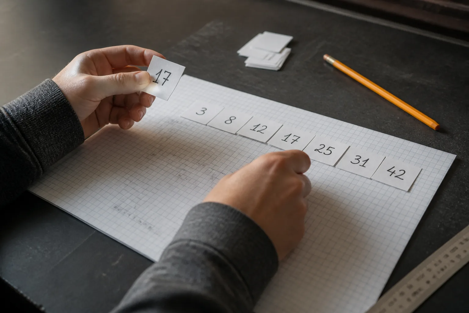
The following method works for a horizontal box plot. A vertical plot uses the same calculations but places the values on a vertical axis.
1. Put the data in ascending order
Arrange every observation from smallest to largest. Sorting is necessary because the minimum, median, quartiles, and maximum depend on position.
Check the number of observations before continuing. Missing a value or accidentally recording one twice can change several summary statistics.
2. Find the median
If the data set contains an odd number of observations, the median is the single middle value.
If it contains an even number, average the two middle values:
Median = (First middle value + Second middle value) ÷ 2
3. Find Q1 and Q3
Divide the ordered observations into lower and upper halves.
Under the median-of-halves convention:
- Q1 is the median of the lower half.
- Q3 is the median of the upper half.
If the full data set has an odd number of observations, some methods exclude the overall median from both halves, while others include it in each half. Check the method required by your class, calculator, or software.
4. Decide which whisker rule applies
For a basic plot, use the minimum and maximum as whisker endpoints.
For a modified box plot, calculate the IQR and outlier fences. End each whisker at the most extreme observed value still inside the fences.
5. Draw a scaled number line
The axis must include every required whisker endpoint and any separately plotted outlier. Use evenly spaced intervals. A scale that changes spacing midway will distort the distribution.
6. Draw the box and median
Draw one side of the box at Q1 and the other at Q3. Add a line inside it at the median.
7. Add whiskers and outlier points
Connect the box to the appropriate lower and upper endpoints. For a modified plot, show values outside the fences as separate dots, circles, or asterisks.
Finish with a clear title, axis label, units, and category label if the plot represents one of several groups.
Complete Box and Whisker Plot Example
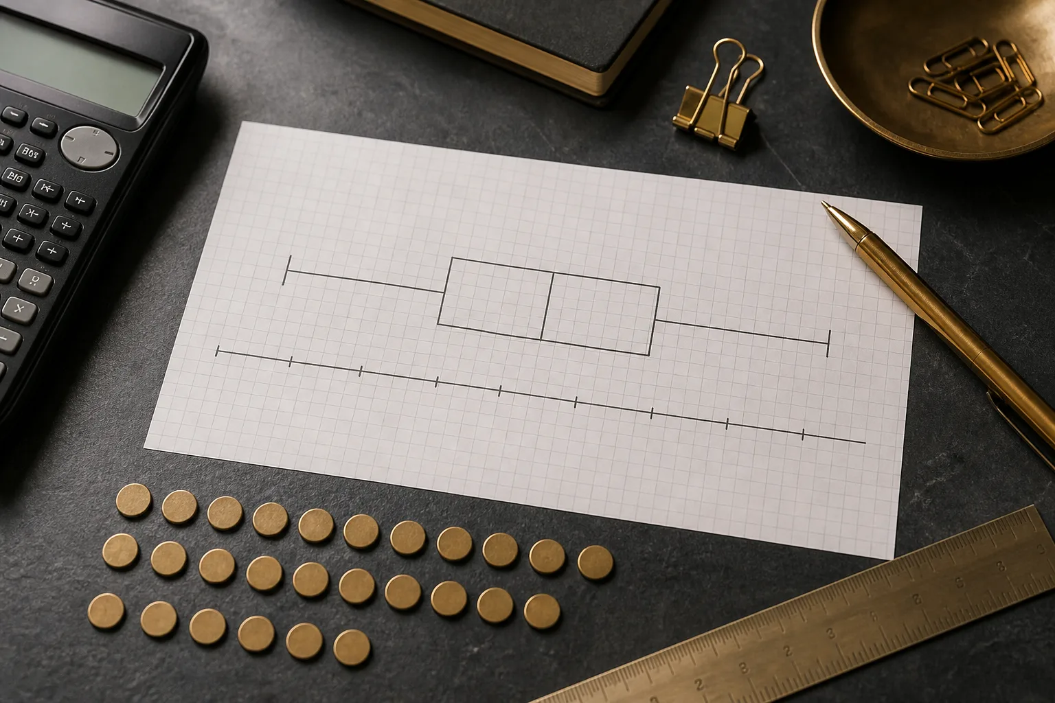
Use this ordered data set:
2, 4, 5, 7, 8, 9, 10, 12, 15, 30
This example uses the median-of-halves method. Because there are ten observations, the full median falls between two values, so there is no overall middle observation to include or exclude from the halves.
Step 1: Find the minimum and maximum
The smallest value is 2, and the largest is 30:
- Minimum = 2
- Maximum = 30
Step 2: Calculate the median
There are ten values, so average the fifth and sixth observations:
Median = (8 + 9) ÷ 2 = 8.5
Therefore:
Q2 = 8.5
Step 3: Calculate Q1
The lower half is:
2, 4, 5, 7, 8
Its middle value is 5:
Q1 = 5
Step 4: Calculate Q3
The upper half is:
9, 10, 12, 15, 30
Its middle value is 12:
Q3 = 12
The ordinary five-number summary is:
| Statistic | Value |
|---|---|
| Minimum | 2 |
| Q1 | 5 |
| Median | 8.5 |
| Q3 | 12 |
| Maximum | 30 |
At this stage, a basic min-to-max plot would place the box from 5 to 12, draw the median line at 8.5, and extend the whiskers to 2 and 30.
Finding Outliers With the 1.5 IQR Rule
A modified box plot checks for potential outliers before choosing its whisker endpoints.
First calculate the interquartile range:
IQR = Q3 − Q1
For the example:
IQR = 12 − 5 = 7
Now find 1.5 times the IQR:
1.5 × 7 = 10.5
Calculate the lower and upper fences:
Lower fence = Q1 − 1.5 × IQR
Lower fence = 5 − 10.5 = −5.5
Upper fence = Q3 + 1.5 × IQR
Upper fence = 12 + 10.5 = 22.5
Any observation strictly below −5.5 or above 22.5 is a potential outlier.
The data contain no values below −5.5. However, 30 is above 22.5, so it is plotted separately.
The modified plot therefore uses:
- lower whisker endpoint = 2;
- Q1 = 5;
- median = 8.5;
- Q3 = 12;
- upper whisker endpoint = 15;
- separate outlier point = 30.
The upper whisker stops at 15 because it is the largest observed value that does not exceed the upper fence. A whisker does not stop at the fence itself unless an actual observation occurs there.
A value exactly on a fence is normally retained as a non-outlier because the usual rule identifies values strictly beyond the fences.
Basic plot versus modified plot
| Feature | Basic min-to-max plot | Modified box plot |
|---|---|---|
| Lower whisker | Minimum value | Smallest non-outlier |
| Upper whisker | Maximum value | Largest non-outlier |
| Outliers | Not separated | Plotted individually |
| Example upper endpoint | 30 | 15 |
| Example separate point | None | 30 |
Both versions can be valid. The important requirement is to state which convention the graph uses.
Why Quartile Answers Sometimes Differ
Quartiles do not have one calculation convention used by every textbook, calculator, statistics package, and spreadsheet.
Common approaches include:
- excluding the overall median from each half;
- including the overall median in both halves;
- calculating percentile positions with interpolation;
- using Tukey hinges;
- using inclusive or exclusive quartile functions.
These differences appear most often with small data sets or an odd number of observations. Two plots can therefore show different Q1 and Q3 values without either being the result of careless arithmetic.
When completing schoolwork, use the convention taught in the course. When analyzing data professionally, document the software and quartile method. When comparing plots, make sure they were created using compatible rules.
How to Read the Finished Plot
A completed box plot provides several useful comparisons.
Median
The line inside the box marks the median. Half the observations fall at or below it, and half fall at or above it, subject to repeated values.
Interquartile range
The length of the box represents the IQR. A longer box means the middle 50% of values have greater numerical spread. A shorter box means they are packed into a smaller interval.
Whiskers
Whisker lengths show spread outside the central box under the chosen rule. An unusually long upper whisker can suggest a longer upper tail, while a longer lower whisker can suggest a longer lower tail.
Possible skewness
The median’s position within the box and the relative whisker lengths can suggest asymmetry. A median near one side of the box and a longer whisker on the other may indicate skew.
However, a box plot compresses the data heavily. It cannot prove the exact distribution shape or show whether the data have two clusters.
Potential outliers
Separate points indicate observations beyond the selected outlier fences. They deserve investigation, but they are not automatically errors.
An outlier may be:
- a valid but unusual measurement;
- a member of a different population;
- a recording or entry mistake;
- the result of an unexpected event.
Do not delete an observation merely because the plot marks it as an outlier.
Comparing Two or More Box Plots

Place multiple box plots on the same numeric scale when comparing groups. Then examine:
- Median: Which group has the higher typical value?
- IQR: Which group has more variation in its middle half?
- Whisker span: Which group has greater non-outlier spread?
- Outliers: Which groups contain unusual observations?
- Possible skew: Are the boxes or whiskers noticeably unbalanced?
- Overlap: How much do their central intervals overlap?
Avoid concluding that two populations are identical simply because their medians match. Their spreads, outliers, sample sizes, and underlying shapes can differ.
A box plot also does not display sample size unless the design adds that information. Two equally sized boxes on a page may summarize very different numbers of observations.
Making a Box Plot in Excel
Recent desktop versions of Microsoft Excel provide a built-in Box and Whisker chart.
- Place each data series in its own column with a clear heading.
- Select the data and headers.
- Open the Insert tab.
- Choose Insert Statistic Chart.
- Select Box and Whisker.
- Add a descriptive title and axis labels.
- Right-click a box and select Format Data Series to review its settings.
Excel can offer options such as:
- showing inner data points;
- displaying outlier points;
- adding mean markers;
- adding a mean line;
- changing gap width;
- selecting inclusive or exclusive median calculations.
The “inclusive” and “exclusive” settings affect how quartiles are calculated. If Excel’s values differ from a hand calculation, check this option before assuming either result is wrong.
Also confirm that Excel interpreted the columns as separate data series. Blank cells, text entries, and misplaced headings can affect the chart.
Making a Box and Whisker Plot in Google Sheets
Google Sheets may not provide the same direct traditional box-plot workflow available in Excel. Depending on the current interface and method, users often calculate summary values and build a workaround chart.
Useful formulas include:
- =MIN(A2:A11)
- =QUARTILE(A2:A11,1)
- =MEDIAN(A2:A11)
- =QUARTILE(A2:A11,3)
- =MAX(A2:A11)
Before plotting, decide whether the QUARTILE behavior matches the quartile convention required for the assignment.
Some tutorials use a candlestick chart as a visual workaround. A standard candlestick chart is not automatically equivalent to a complete box and whisker plot. In particular, it may not display the median line or handle outliers in the same way.
If using a workaround:
- calculate and verify the summary statistics;
- preserve the median information;
- determine outliers separately when required;
- label the chart clearly;
- explain the chosen quartile and whisker rules.
For graded or professional work, confirm that the final graphic includes every required feature rather than relying only on its visual resemblance to a box plot.
Mistakes That Distort a Box Plot
Forgetting to sort the data
Quartiles based on unsorted observations will usually be incorrect.
Using an uneven scale
Equal numerical changes must occupy equal distances on the axis.
Confusing fences with whisker endpoints
The fences are calculated limits. Whiskers stop at actual observed values within those limits.
Sending whiskers to outliers
In a modified box plot, potential outliers appear separately rather than becoming whisker endpoints.
Mixing quartile conventions
Switching methods halfway through the calculation produces an inconsistent five-number summary.
Putting the mean in place of the median
The standard center line represents the median, not the mean.
Assuming each section has equal width
Quartile sections contain roughly equal proportions of observations, but their numerical spans can differ.
Frequently Asked Questions
What are the five numbers in a box plot?
The five-number summary consists of the minimum, Q1, median, Q3, and maximum. In a modified plot, the displayed whisker endpoints are the smallest and largest non-outlier observations, while potential outliers appear separately.
Do box plot whiskers go to the minimum and maximum?
They do in a basic min-to-max box plot. In a modified plot, whiskers end at the most extreme observed values within the 1.5 IQR fences. Values beyond those limits are shown separately.
How do you calculate IQR for a box plot?
Subtract the first quartile from the third quartile:
IQR = Q3 − Q1
The IQR measures the spread of the middle 50% of observations and is used to calculate potential-outlier fences.
Do you include the median when finding quartiles?
It depends on the convention. Some methods exclude the overall median when the sample size is odd, while others include it in both halves or use percentile interpolation. Follow the method required by your course or software.
Does a box plot show the mean?
Not in its standard form. The line inside the box represents the median. Some software can add a separate mean marker, but it is not part of the five-number summary.
Can a box plot have no outliers?
Yes. If every observation falls within the lower and upper outlier fences, there are no potential outliers under the 1.5 IQR rule. The whiskers then reach the minimum and maximum observed values.
Can you make a box plot with negative numbers?
Yes. Sort the values normally and use a number line that includes the negative range. The formulas for the median, quartiles, IQR, fences, and whiskers do not change.
What does the box represent?
The box extends from Q1 to Q3 and represents the middle 50% of the ordered observations. Its length equals the interquartile range. The line inside it marks the median.
Build the Plot From Verified Statistics
The reliable way to learn how to make a box and whisker plot is to separate the work into two parts: calculate the summary correctly, then draw the graph according to a stated convention.
Sort the observations, verify Q1, the median, and Q3, and decide whether the whiskers use the full range or the modified 1.5 IQR rule. A neat drawing cannot correct inaccurate quartiles, and software output is meaningful only when its calculation settings match the method you intend to use.
Share this guide

About the author
Misbah Shafique
Misbah Shafique creates clear, carefully researched guides about box-and-whisker plots, statistics, data visualization, and practical math concepts.
Related articles

Ready to plot your own data?
Paste your values into our free tool, customize the result, and export a publication-ready box plot.
Open the box plot maker