
Fundamentals
5 Values That Make Up a Box and Whisker Plot
Learn the five-number summary behind every box plot, calculate each value, and understand how quartiles, whiskers, IQR, and outliers work together.

The 5 values that make up a box and whisker plot are the minimum, first quartile (Q1), median (Q2), third quartile (Q3), and maximum. Together, these statistics form the five-number summary of a data set.
Although the list is simple, one detail often causes confusion. In a traditional box plot, the whiskers may extend to the minimum and maximum. In a modified box plot, the whiskers stop at the smallest and largest values that are not outliers. Any outliers appear as separate points.
Understanding this distinction helps you calculate, draw, and interpret box plots correctly. It also explains why a graph created by statistical software may look different from one drawn using a basic classroom method.
Quick Answer
The five-number summary used for a box and whisker plot consists of:
- Minimum
- First quartile, or Q1
- Median, or Q2
- Third quartile, or Q3
- Maximum
The box runs from Q1 to Q3, with the median marked inside it. Whiskers extend outward, although modified plots stop them at the most extreme non-outlier observations.
The Five-Number Summary at a Glance
The five numbers divide an ordered data set into four sections. Each section contains approximately 25% of the observations, though the numerical widths of the sections may differ.
| Value | Statistical meaning | Position on a traditional box plot |
|---|---|---|
| Minimum | Smallest value in the ordered data set | End of the lower whisker |
| First quartile, Q1 | Middle of the lower half; about 25% of values lie below it | First edge of the box |
| Median, Q2 | Central value of the ordered data set | Line inside the box |
| Third quartile, Q3 | Middle of the upper half; about 75% of values lie below it | Second edge of the box |
| Maximum | Largest value in the ordered data set | End of the upper whisker |
These five box plot values summarize location and spread without displaying every observation.
Modified plots require an extra qualification. The five-number summary may still contain the raw minimum and maximum, but the visible whiskers usually represent the smallest and largest non-outlier values.

What Each of the Five Values Means
1. Minimum
The minimum is the smallest observation in the complete ordered data set. It marks the low end of the data range.
For the values 3, 7, 9, 11, and 15, the minimum is 3.
On a traditional box plot, the lower whisker reaches this value. On a modified Tukey box plot, the minimum appears as the whisker endpoint only if it is not classified as an outlier.
2. First quartile, Q1
The first quartile, also called the lower quartile, identifies the center of the lower half of the data. It is commonly interpreted as the 25th percentile.
Approximately one-quarter of the observations lie at or below Q1, while approximately three-quarters lie at or above it. Q1 forms the first edge of the box.
Its calculation depends on the quartile convention being used. A common classroom method finds Q1 by taking the median of the values below the overall median.
3. Median, Q2
The median is the middle of an ordered data set and is also called the second quartile or Q2. It represents the 50th percentile.
If the data set contains an odd number of observations, the median is the value in the exact middle. If it contains an even number, the median is the average of the two central values.
The median appears as a line inside the box. It is not necessarily located halfway between Q1 and Q3 because the numbers in each half may have different amounts of spread.
4. Third quartile, Q3
The third quartile, or upper quartile, marks the center of the upper half of the ordered data. It is associated with the 75th percentile.
Approximately 75% of observations lie at or below Q3, and about 25% lie at or above it. Q3 forms the other edge of the box.
Using the median-of-halves method, Q3 is found by calculating the median of the values above the overall median.
5. Maximum
The maximum is the largest observation in the full data set. Along with the minimum, it determines the total range:
Range = maximum − minimum
In a traditional plot, the upper whisker reaches the maximum. In a modified plot, an outlying maximum is shown separately, and the whisker stops at the largest non-outlier observation.
How to Find the 5 Values That Make Up a Box and Whisker Plot
Begin by arranging every observation from smallest to largest. Calculating quartiles from unsorted data is one of the most common box-plot mistakes.

Then follow these steps:
- Identify the smallest value as the minimum.
- Find the median of the complete data set.
- Divide the ordered observations into lower and upper halves.
- Find the median of the lower half to obtain Q1.
- Find the median of the upper half to obtain Q3.
- Identify the largest value as the maximum.
Written in order, the result is:
Five-number summary = minimum, Q1, median, Q3, maximum
Before calculating Q1 and Q3, check which quartile convention your teacher, textbook, calculator, or software requires. Different accepted methods can produce different quartiles from the same data.
Complete Five-Number Summary Example
Consider this ordered data set:
2, 4, 5, 7, 8, 9, 11, 13, 14, 30
This example uses the median-of-halves convention. Because there are 10 observations, the lower five and upper five form the two halves.
Find the minimum and maximum
The smallest and largest observations are:
- Minimum = 2
- Maximum = 30
Find the median
The two central values are 8 and 9.
Median = (8 + 9) ÷ 2 = 8.5
Therefore, Q2 is 8.5.
Find Q1
The lower half is:
2, 4, 5, 7, 8
Its middle value is 5.
Q1 = 5
Find Q3
The upper half is:
9, 11, 13, 14, 30
Its middle value is 13.
Q3 = 13
The box plot five-number summary is therefore:
2, 5, 8.5, 13, 30
These values provide the minimum, Q1, median, Q3, and maximum in the correct order.
From Five Numbers to a Box Plot
Once the five values are known, they can be placed on a scaled number line.
For a horizontal traditional plot:
- Mark the minimum at 2.
- Draw the first edge of the box at Q1 = 5.
- Draw a line inside the box at the median = 8.5.
- Draw the second edge at Q3 = 13.
- Mark the maximum at 30.
- Connect the box to the minimum and maximum with whiskers.
A vertical box plot uses the same positions along a vertical scale. Its orientation changes, but the statistical meaning does not.
The box extends from 5 to 13 and represents the middle 50% of the observations. The distance between these quartiles is the interquartile range.
IQR = Q3 − Q1
For this example:
IQR = 13 − 5 = 8
The IQR describes the spread of the central half of the data. Because it is not directly affected by extremely low or high observations, it is more resistant to outliers than the total range.
Why the Maximum May Not Be the Upper Whisker
Many textbooks first teach a traditional box plot in which the whiskers connect Q1 and Q3 to the minimum and maximum. Statistical software commonly produces a modified Tukey box plot instead.
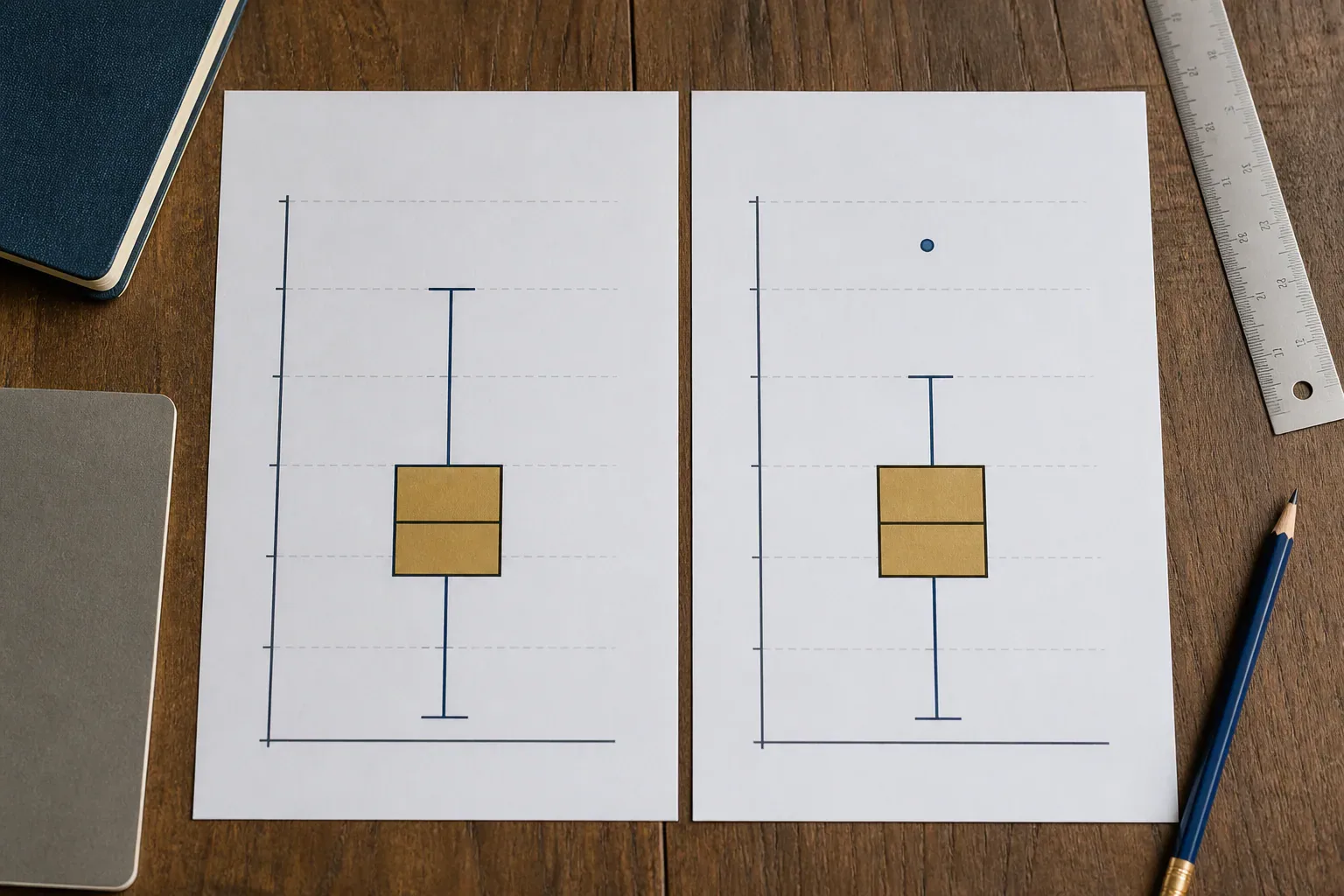
A modified plot uses the IQR to calculate outlier fences:
Lower fence = Q1 − 1.5 × IQR
Upper fence = Q3 + 1.5 × IQR
Using the example values:
Lower fence = 5 − 1.5(8) = −7
Upper fence = 13 + 1.5(8) = 25
The value 30 is above 25, so it is flagged as a potential outlier.
In the modified version:
- The lower whisker ends at 2 because 2 is within the fences.
- The upper whisker ends at 14, the largest observation within the fences.
- The value 30 appears as an isolated point.
This means 30 remains the raw maximum of the data set, but it is not the upper whisker endpoint. Confusing those two values can lead to an incorrect reading of the graph.
A flagged observation is not automatically an error. It may be a valid unusual result, a measurement problem, or evidence of something worth investigating.
Why Quartile Calculators Sometimes Disagree
There is no single quartile convention used by every textbook and software package. Several methods are statistically accepted, and they handle positions between observations differently.
For an odd number of observations, one method excludes the overall median before finding Q1 and Q3. Another includes it in both halves. Software may instead calculate percentiles through interpolation.
For example, Microsoft Excel offers QUARTILE.INC and QUARTILE.EXC. These functions use different percentile conventions, so they can return different results. A TI-84 calculator, Google Sheets, Python, R, or another statistics calculator may also use a particular default method.
A difference does not automatically mean one result is wrong. For consistent work:
- Use the method requested in the assignment.
- State the quartile convention when showing calculations.
- Apply the same method throughout the analysis.
- Do not combine quartiles from one method with outlier calculations from another.
This issue matters most in small data sets. As the number of observations increases, differences between quartile methods often become less noticeable, though they can still affect borderline outlier decisions.
What the Five Values Reveal About a Distribution
A box plot compresses a large set of numerical data into a readable picture. Its five points help describe several features.
Center
The median shows the central position of the data. Unlike the mean, it is not pulled as strongly by an extreme observation.
Middle spread
The length of the box represents the IQR and therefore the spread of the middle 50% of observations. A short box shows that the middle half is relatively concentrated. A long box shows greater variability.
Overall spread
In a traditional plot, the distance from the minimum to the maximum represents the total range. In a modified plot, the whisker-to-whisker distance excludes separately displayed outliers and should not automatically be called the full data range.
Possible skewness
Unequal box sections or whiskers may suggest an asymmetric or skewed distribution. For example, a long upper whisker can indicate that higher observations are more spread out.
A box plot alone does not prove the exact shape of a distribution. Different data sets can share the same five-number summary.
Potential outliers
Points beyond the whiskers of a modified plot draw attention to unusual observations. They should be examined in context rather than deleted automatically.
Common Errors When Reading the Plot
A few mistakes account for many incorrect answers.
First, the line inside the box represents the median, not the mean. A standard box plot does not normally show the arithmetic mean unless an additional symbol has been included and labeled.
Second, each section represents roughly one-quarter of the observations, not one-quarter of the numerical distance. A whisker can be much longer than half the box and still represent a similar proportion of observations.
Third, whiskers do not always equal the raw minimum and maximum. You must determine whether the graph is traditional or modified.
Fourth, a box plot does not usually reveal every value, the number of observations, or the exact frequency of repeated numbers. Two data sets with very different individual values can produce identical boxplot summary statistics.
Finally, repeated values may cause parts of the plot to overlap. If Q1 equals the median, for example, the median line can sit directly on the edge of the box. This is valid and does not mean the graph is incomplete.
FAQs
What are the five numbers needed for a box plot?
The five numbers are the minimum, first quartile, median, third quartile, and maximum. They are written in increasing order and collectively called the five-number summary. A modified plot may use non-outlier observations as its visible whisker endpoints while showing extreme values separately.
Is the mean included in a box and whisker plot?
No. The mean is not normally part of the five-number summary. The line inside the box represents the median. Some software can add a separate mean marker, but that is an optional feature rather than one of the standard five box plot values.
Does the box contain 50% of the data?
Yes, approximately the middle 50% lies between Q1 and Q3. About 25% lies between the minimum and Q1, another 25% between Q1 and the median, another quarter between the median and Q3, and the final quarter above Q3.
What do the whiskers represent?
In a traditional box plot, the whiskers extend toward the minimum and maximum. In a modified box plot, they reach the smallest and largest observations that remain within the outlier fences. Values beyond those endpoints are plotted individually.
How do you calculate the IQR from a box plot?
Subtract the first quartile from the third quartile:
IQR = Q3 − Q1
If Q1 is 12 and Q3 is 20, the IQR is 8. It measures the spread of the central 50% and helps establish potential outlier fences.
Are outliers included in the five-number summary?
The raw five-number summary normally uses the actual minimum and maximum, including extreme observations. However, terminology varies in some explanations. A modified plot usually places outliers beyond the whiskers as separate points. Always check whether “minimum” and “maximum” refer to raw extremes or adjacent non-outlier values.
Why do two calculators give different quartiles?
They may use different quartile conventions. One calculator might find the medians of two halves, while another uses inclusive percentiles, exclusive percentiles, or interpolation. Choose the method required for your course or project and state it clearly when presenting the answer.
Remember the Five Positions
The 5 values that make up a box and whisker plot summarize the low end, lower quarter, center, upper quarter, and high end of an ordered data set. Before interpreting the whiskers, determine whether the graph is traditional or modified. That one check prevents confusion between the actual minimum and maximum and the most extreme non-outlier values.
Share this guide

About the author
Misbah Shafique
Misbah Shafique creates clear, carefully researched guides about box-and-whisker plots, statistics, data visualization, and practical math concepts.
Related articles

Ready to plot your own data?
Paste your values into our free tool, customize the result, and export a publication-ready box plot.
Open the box plot maker